6 Design Tactics You Should Know About to Stay Ahead of the Competition in 2017
January 5, 2017
Design is one of the main differentiators between a successful product and a failed product.
This maxim has held true for a good part of this century. Thanks in large parts to Apple’s initial success, design – as a practice and as a philosophy – has been the pursuit of so many businesses, digital or otherwise.
But design is ever evolving. In software, we’ve moved from skeuomorphic designs in the 2010s to the flat, minimalist trends of today.
What design tactics should you know about for 2017? Which trends will help your products stand apart from the competition?
I’ll answer these questions and more below.
1. Add UI Animations to Create Delightful Moments
UI animation is an emerging trend that adds a dash of vibrancy to otherwise dull user interactions. A simple animation can make something as mundane as closing a tab or tapping a button much more delightful.
This should be a top priority for software-focused businesses. It’s an inexpensive way to add small but memorable moments to the user experience that your site visitors won’t soon forget.
UI animations go beyond animating an element; they also help users guess the result of an action. For example, the animation below includes a small preview of the resulting action which answers the basic questions the user might have before they even have to ask.
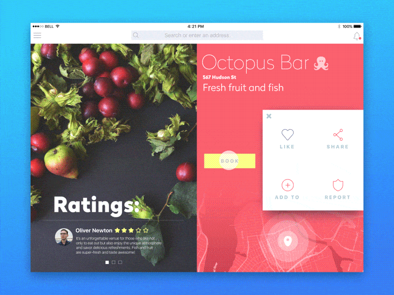
Another tactic you can include is “micro-interactions” in your designs. These work particularly well on mobile screens where small interactions – such as closing a tab – can be turned into a delightful experience.
For example, consider this animation that turns a “Close” button into a navigation menu “burger” icon:

For inspiration, see some of the animation patterns at Zurb’s PatternTap.
2. Design for Digital Novices
A recent survey of 215,942 adults found that:
- 26% of people can’t use computers.
- 14% of people can’t perform a basic task such as deleting an email message.
- Only 5% can perform “complex” computer tasks.
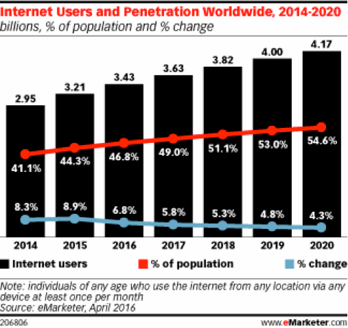
At the same time, hundreds of millions of new people will come online in 2017.
Poor computer skills combined with millions of new users means that you have to design your products for digital novices.
Essentially, this means your user-experience journey maps should focus on failure by default – users who can’t understand what to do or how to do something on your site or app.
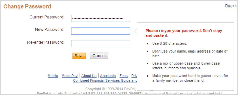
A simple example of this would be the password selection process during sign-up. A “design for failure” would assume that users don’t know how to select a secure password. It would summarily reject weak passwords and/or offer hints to select better passwords.
Paypal’s password helper is an excellent example of turning failure into an opportunity:
3. Design for the “Slack-ification” of Products
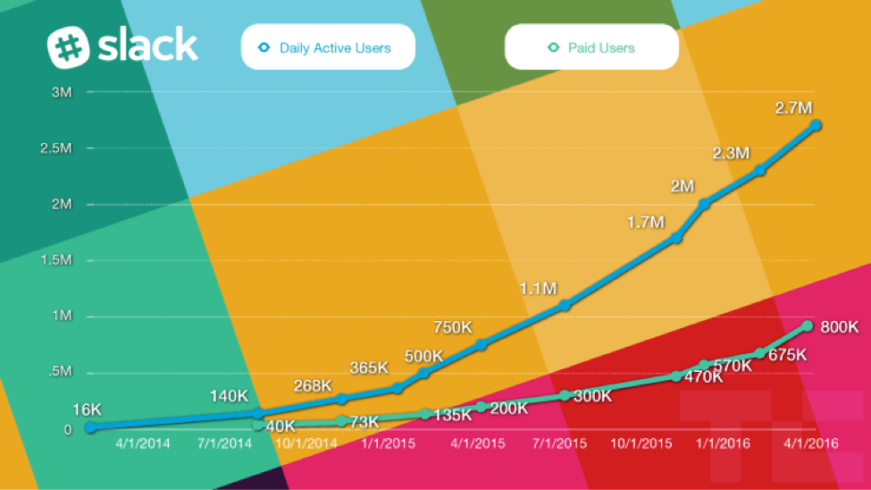
There are few enterprise businesses that have experienced Slack’s growth trajectory. Its hockey-stick-shaped growth is more reminiscent of social media startups, not enterprise communication apps.
Slack’s widespread adoption hasn’t just affected the way businesses communicate, it has also affected how enterprise apps communicate with their users.
Slack’s design and marketing are famously conversational and, at times, even irreverent. Between the emojis and the humor, Slack manages to create a delightful user experience that doesn’t feel like a stodgy enterprise product.
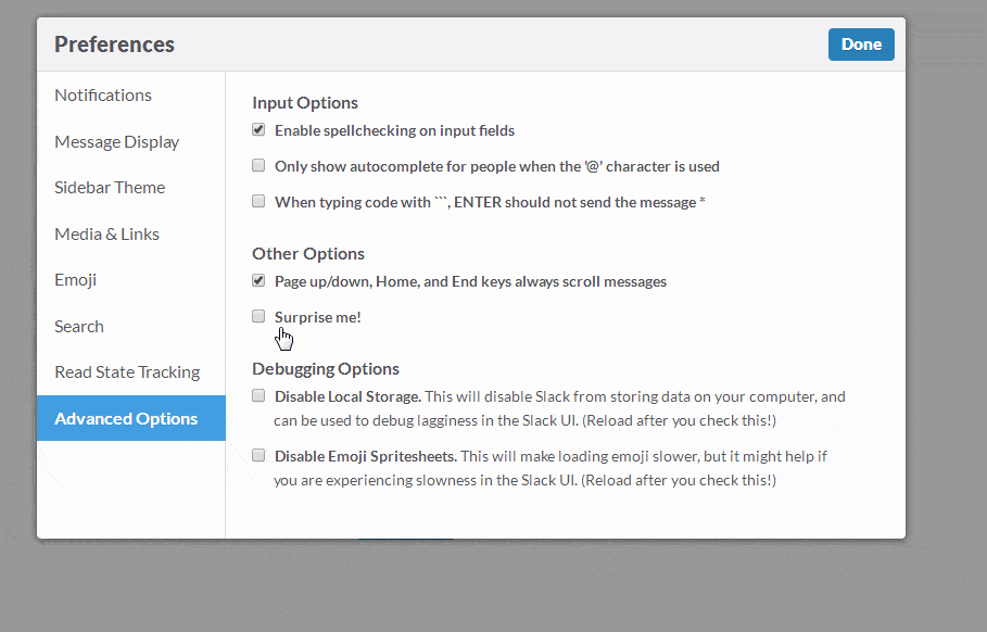
One example: when you go to Preferences → Advanced Options in your Slack account, you’ll see a checkbox that says “Surprise Me!” Selecting it shows an animated bear that “surprises” you.
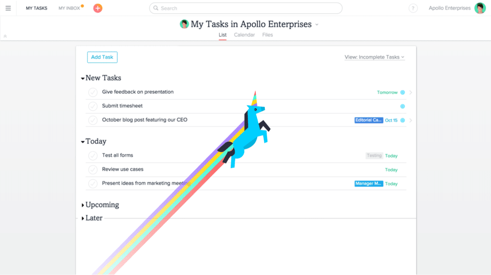
New enterprise startups such as Asana do the same. Completing a series of tasks on Asana, for instance, triggers a flying unicorn.
This is a far cry from the dry enterprise software you know and use.
As an example, compare Slack to its recently launched competitor, Microsoft Teams. You’ll find that the latter focuses entirely on staid feature descriptions at the expense of user delight.
This coming “Slack-ification” of enterprise products means that you’ll have to design for user experience, not just for features. It’s a very different product direction, but it will help set you apart from the competition.
4. Use Age-responsive Design and Personalization
The idea behind age-responsive design is simple: people of different ages use websites differently. A 7-year-old who has been playing with an iPad since she was 3 has a very different level of comfort with digital content than a 70-year-old who picked up a smartphone last year.
Offering both these demographics the same responsive design experience makes for a bad user experience.
Your website can track on-site user action and combine it with demographics data to estimate your user’s age group. You can then use that information to craft age-specific experiences.
For example, you might use larger fonts and larger line spacing for older users. For younger people, you might collapse the navigation menu and remove visual cues since this age group is already comfortable with digital interfaces.
You can take things a step further and add personalization for each user experience.
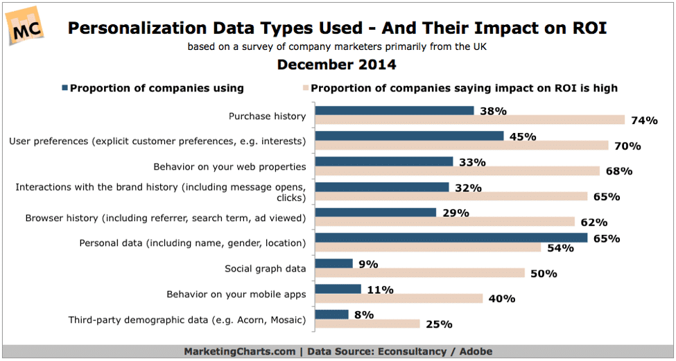
According to MarketingCharts, an overwhelming majority of marketers say that personalization has a positive ROI, even when the personalization is as simple as using the customer’s name.
5. Design for Trust
Trust is an essential component of design. You might even say that building trust is the entire purpose of good design.
A design of this nature revolves around communicating your site’s trustworthiness and fulfills Jakob Nielsen’s “4 credibility factors”:
- Design quality: Quite simply, good design is deemed more trustworthy. This is particularly true in industries marred by fraud or spam such as fitness and nutrition/diet.
- Upfront disclosure: Disclose key terms like shipping policies and offer details upfront with your design. Your users should have no ambiguity as to what your business does and what service level agreements it adheres to.
- Comprehensive and current: Your users shouldn’t have to search elsewhere for answers to key questions. Include an FAQ, ample documentation and helpful resources to assist site visitors.
- Connected to the rest of the web: Your site shouldn’t be a silo; outgoing links indicate that you are a part of the web. While there are certain exceptions (such as checkout or landing pages), your site should feel like it is a part of the web, not an isolated experience.
How you do this is an open matter, but being transparent with your users and focusing on better design is a good place to start.
6. Use Design as a Storytelling Tool
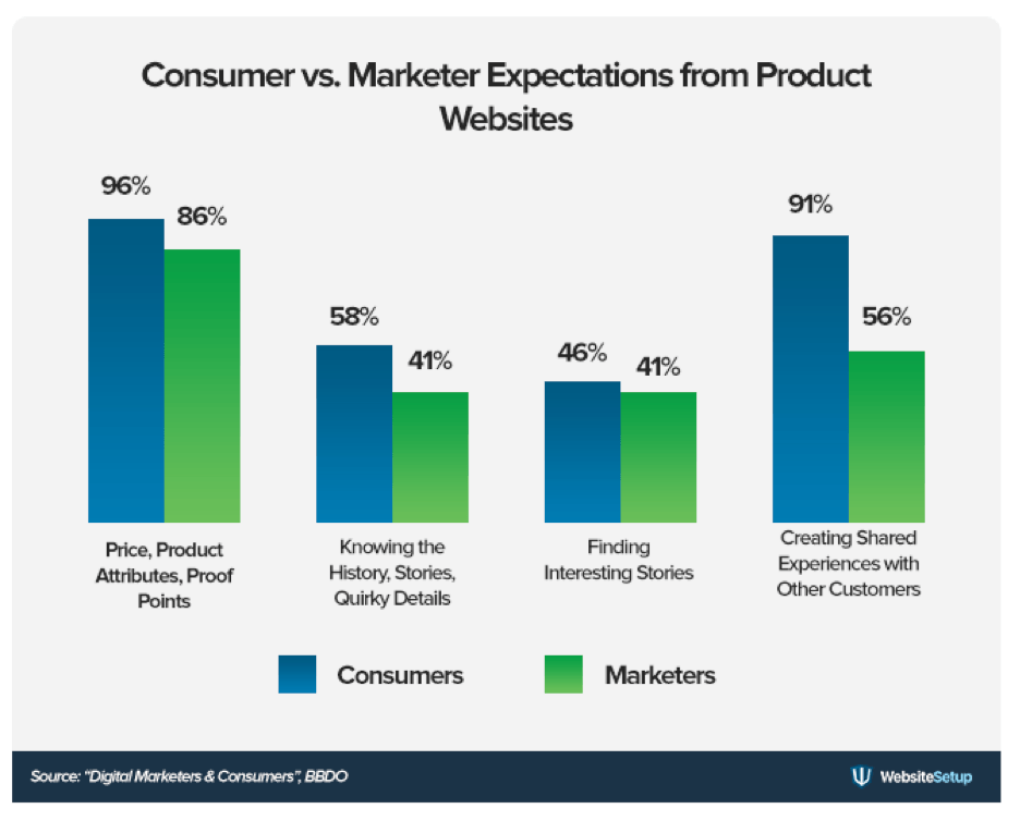
Storytelling is one of your most powerful marketing tools, yet it is widely underused. According to WebsiteSetup, while 58% of consumers want to know the story behind a product, only 41% of marketers actually do the same.
One way to add storytelling to your marketing mix is through design.
The oft-sited New York Times story Snow Fall is a wonderful example of design as a storytelling tool. This article includes moving pictures, embedded video, slide show and 3-D maps throughout that give the reader a totally interactive experience.
Product-focused businesses don’t have to take the content route to tell stories; they can also use design to show users how their product works.
Case in point: Webydo. Through clever use of parallax scrolling, Webydo shows users how its product works and how they can use it to create compelling experiences (click on the website and scroll down to experience it!).
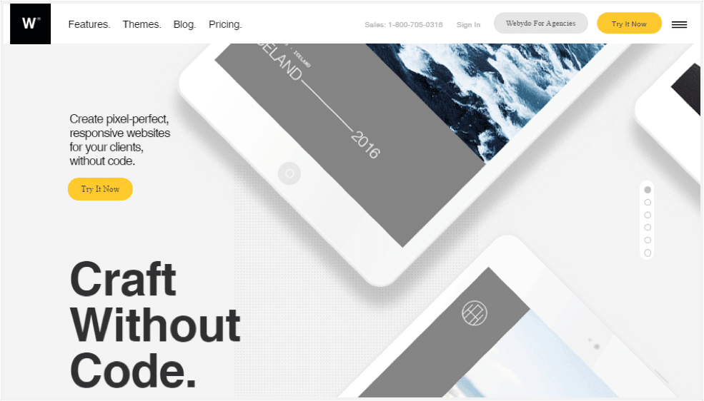
Strong design turns a conventional product demo into a compelling visual story. Not only is it aesthetically pleasing, it also gives users a real-world use-case for the product.
Consider ditching conventional product demos and doing something similarly vibrant for your product.
Great design is not only visually pleasing, it is also a compelling marketing tool. Start by experimenting with these 6 design tactics in 2017. Clever use of animations, parallax scrolling and trust elements can make your site look better and improve conversion rates.
At the same time, adopt a design-first philosophy to compete with the “Slack-ification” of enterprise apps. While you’re at it, focus on creating “failure-proof” designs that help your least technically skilled users get what they want.